Project 1: Redesign a flight booking experience
Aim: To simplify the flight booking process, remove distractions, and clarify luggage information.
User Research:
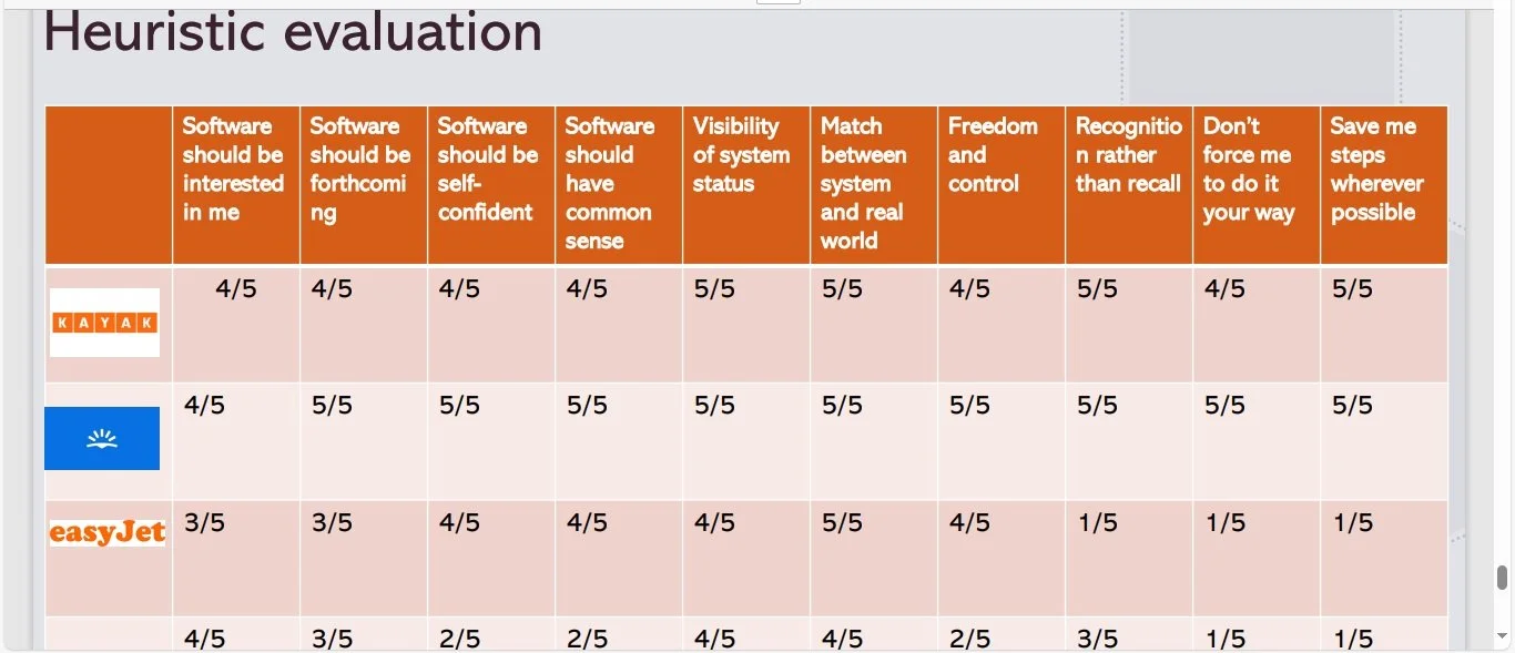
Competitive Benchmarking:
I analysed Ryanair, EasyJet, Skyscanner, and Kayak using heuristic evaluation (scored out of 50) to understand industry standards and identify best practices.Online Survey:
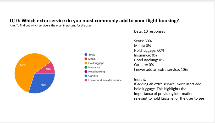
The survey gathered both quantitative and qualitative data on user behaviour, goals, and pain points when booking flights. Key insights included:Most users book flights from home on their phones, primarily to compare prices.
60% of users prioritise price when booking.
Common pain points include confusion over what’s included in the cost and unclear luggage allowances.
Usability Testing:
I conducted usability tests on Aer Lingus, Eurowings, Ryanair, and EasyJet, observing how users interact with the booking process. Findings included:Overload of information (ads, flashing images, hotel/car hire options) causes confusion.
Costs and luggage allowances are often unclear.
Some features seem random and ambiguous
Analysis:
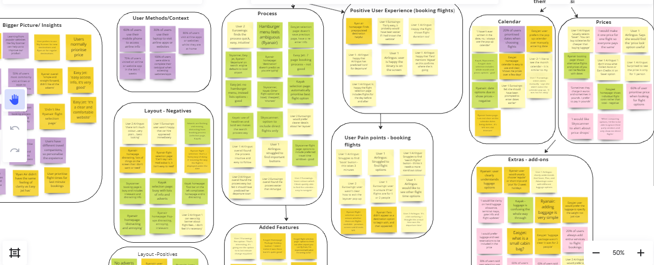
Affinity Diagram:
I synthesised data from research and testing by categorising insights into themes:User pain points: unclear luggage info, hidden costs.
Positive and negative layout elements.
Extra features that users didn’t understand or use.
Key conclusions:
Luggage info should be clear throughout.
Costs must be upfront and inclusive.
Pages should focus only on relevant booking details.
Any features should be clear and easily understood
Design must be simple and non-distracting.
Miro board: https://miro.com/app/board/uXjVMy5CLek=/
Customer Journey Map:
Using the affinity diagram, I mapped the entire booking process, identifying areas for improvement based on user pain points, goals, and behaviours.
Design Phase:
Flow Diagram:
I created a flow diagram to visualise the user’s booking journey, focusing on the most likely path to ensure smooth navigation.Interaction Design & Prototyping:
I sketched the prototype based on research insights and then developed a medium-fidelity prototype with interactive elements. Testing ensured the user journey was intuitive. Please note that the Fly Me Prototype is currently under development while I update it with some UI design.
Annotations and Handover:
I added clear annotations to the Figma prototype, detailing all interactions and screen state changes for both engineers and the UI designer.
Conclusion:
The redesign improved the booking experience by:
Clarifying luggage information.
Displaying only essential information.
Making costs transparent throughout the process.